class: center, top, title-slide .title[ # STAT 302 Statistical Computing ] .subtitle[ ## Lecture 4: Data Manipulation and Visualization ] .author[ ### Yikun Zhang (<em>Winter 2024</em>) ] --- # Outline 1. Using Packages in R 2. Data Manipulation via `tidyverse` 3. Basic Graphics in R 4. Data Visualization via `ggplot2` <font size="4">* Acknowledgement: Parts of the slides are modified from the course materials by Prof. Ryan Tibshirani, Prof. Yen-Chi Chen, Prof. Deborah Nolan, Bryan Martin, and Andrea Boskovic. </font> --- class: inverse # Part 1: Using Packages in R --- # What is an R package? R packages contain code, data, and documentation in a standardized collection format that can be installed and utilized by users of R. -- - There are 19,961+ official R packages available on [Comprehensive R Archive Network (CRAN)](https://cran.r-project.org/web/packages/available_packages_by_name.html). Apart from that, some unofficial R packages are also posted on [GitHub](https://github.com/). -- - These packages implement miscellaneous statistical methods using functions in R, which makes our programming and data analysis easier. <p align="center"> <img src="./figures/DebiasInfer.png" width="800"/> </p> --- # How Can We Install R Packages? If a package is officially available on [CRAN](https://cran.r-project.org/web/packages/available_packages_by_name.html), like most packages we will use for this course, we can install it using ```r install.packages("PACKAGE_NAME_IN_QUOTES") ``` Or, we can use the "_Packages_" tab in the lower right panel and click the "_Install_" button to install an official package in RStudio. - After a package is installed, it is saved on our computer until we update R, and we don't need to re-install it. - There is no need to include a call to `install.packages()` in any `.R` or `.Rmd` file! -- Occasionally, we may want to install an R package from a `.tar.gz` file downloaded from CRAN or elsewhere: ```r install.packages("pkgname.tar.gz", repos = NULL, type ="source") ``` --- # How Can We Use R Packages? After a package is installed, we can load it into our current R session using `library()` or `require()` if it is inside our customized function: ```r library(PACKAGE_NAME) # or library("PACKAGE_NAME") ``` - Unlike `install.packages()`, it is not necessary to include the package name in quotes. -- - Loading a package must be done with each new R session, so we should put calls to `library()` in our `.R` and `.Rmd` files whenever we use some R packages in our code. - In `.Rmd` files, we can load all the required packages in the opening chunk and set the parameter `include = FALSE` in that chunk to hide the messages and code. ```{r, include = FALSE} ``` --- # Install R Packages From Github There is an `install_github()` function to install R packages hosted on GitHub in the `devtools` package, though it requests developer's name. ```r library(devtools) install_github("DeveloperName/PackageName") ``` Here is an example where we don't have to load the `devtools` package: ```r devtools::install_github("zhangyk8/Debias-Infer", subdir = "R_Package") ``` -- The `githubinstall` package provides a function `githubinstall()`, which does not need developer's name. ```r library(githubinstall) githubinstall("PackageName") ``` --- class: inverse # Part 2: Data Manipulation via `tidyverse` --- # What is `tidyverse`? The `tidyverse` is a coherent collection of packages in R for data science (and `tidyverse` itself is also a package that loads all its constituent packages). Packages include: - Data reading and saving: `readr`. - Data manipulation: `dplyr`, `tidyr`. - Iteration: `purrr`. - Visualization: `ggplot2`. We can install all of them using ```r install.packages("tidyverse") ``` Note: We only need to do this once! --- # Why Do We Need `tidyverse`? - These packages have a very consistent API as well as an active developer and user community. - [Ranking CRAN R Packages by Number of Downloads](https://www.datasciencemeta.com/rpackages). -- - Function names and commands follow a focused grammar. - The functions are powerful and fast when working with data frames and lists (matrices, not so much, yet!). - Pipes (`%>%` operator) allows us to fluidly glue functionality together. - At its best, `tidyverse` code can be read like a story using the pipe operator! --- # Load `tidyverse` into R We can load all the `tidyverse` packages into our current R session using the `library()` function. ```r library(tidyverse) ``` ``` ## ── Attaching core tidyverse packages ──────────────────────── tidyverse 2.0.0 ── ## ✔ dplyr 1.1.3 ✔ readr 2.1.4 ## ✔ forcats 1.0.0 ✔ stringr 1.5.1 ## ✔ ggplot2 3.4.3 ✔ tibble 3.2.1 ## ✔ lubridate 1.9.2 ✔ tidyr 1.3.0 ## ✔ purrr 1.0.2 ## ── Conflicts ────────────────────────────────────────── tidyverse_conflicts() ── ## ✖ dplyr::filter() masks stats::filter() ## ✖ dplyr::group_rows() masks kableExtra::group_rows() ## ✖ dplyr::lag() masks stats::lag() ## ℹ Use the conflicted package (<http://conflicted.r-lib.org/>) to force all conflicts to become errors ``` --- # Conflicts in Using R Packages Recall that R packages encapsulate functions written by different R developers. - Occasionally, some of these functions in different packages may share the same name, which introduces a conflict. -- - Whichever package that we load more recently using `library()` will mask the old function, meaning that R will default to that version. -- - In general, this is fine, especially with `tidyverse`. The conflict message is to make sure that we are aware of conflicts. --- # Data Manipulation in a Tidy Way - The packages `dplyr` and `tidyr` are going to be our main workhorses for data manipulation. - The main data type used by these packages is the data frame (or tibble, but we won't go there). -- Why do we need to learn data manipulation through `tidyverse`? - Learning pipes `%>%` will facilitate our learning of the `dplyr` and `tidyr` verbs (or functions). - The functions in `dplyr` are analogous to SQL counterparts, so learning `dplyr` will get some SQL syntax for free! --- # Learning Pipes `%>%` Piping at its most basic level: - _It uses the `%>%` operator to take the output from a previous function call and "pipe" it through to the next function, in order to form a flow of results._ -- This can really help with the readability of code when we use multiple nested functions! - **Shortcut for typing `%>%`:** use `ctrl + shift + m` in RStudio. Note: In Linux and other related systems, we also have pipes, as in: ```bash ls -l | grep tidy | wc -l ``` --- # The Logics of Pipes with Single Arguments Passing a single argument through pipes, we interpret the following code as `\(h(g(f(x)))\)`. ```r x %>% f %>% g %>% h ``` Note: In our mind, when we see the `%>%` operator, we should read this as "and then". -- We can write `exp(1)` with pipes as `1 %>% exp`, and `log(exp(1))` as `1 %>% exp %>% log`. ```r 1 %>% exp ``` ``` ## [1] 2.718282 ``` ```r 1 %>% exp %>% log ``` ``` ## [1] 1 ``` --- # The Logics of Pipes with Multiple Arguments For multi-arguments functions, we interpret the following code as `\(f(x,y)\)`. ```r x %>% f(y) ``` -- We can subset top 1 row of the `mcars` data frame using the following pipes syntax. ```r # Syntax in basic R head(mtcars, 1) ``` ``` ## mpg cyl disp hp drat wt qsec vs am gear carb ## Mazda RX4 21 6 160 110 3.9 2.62 16.46 0 1 4 4 ``` ```r # Pipes syntax mtcars %>% head(1) ``` ``` ## mpg cyl disp hp drat wt qsec vs am gear carb ## Mazda RX4 21 6 160 110 3.9 2.62 16.46 0 1 4 4 ``` --- # The Logics of Pipes with Multiple Arguments The command `x %>% f(y)` can be equivalently written in **dot notation** as: ```r x %>% f(., y) ``` -- What is the advantage of using dots? - Sometimes we may want to pass in a variable as the second or third (say, not first) argument to a function, with a pipe. As in: ```r x %>% f(y, .) ``` which is equivalent to `\(f(y,x)\)`. --- # Some Examples with Pipes Let's interpret the following code without executing it first. ```r state_df = data.frame(state.x77) state.region %>% tolower %>% tapply(state_df$Income, ., summary) ``` -- ``` ## $`north central` ## Min. 1st Qu. Median Mean 3rd Qu. Max. ## 4167 4466 4594 4611 4694 5107 ## ## $northeast ## Min. 1st Qu. Median Mean 3rd Qu. Max. ## 3694 4281 4558 4570 4903 5348 ## ## $south ## Min. 1st Qu. Median Mean 3rd Qu. Max. ## 3098 3622 3848 4012 4316 5299 ## ## $west ## Min. 1st Qu. Median Mean 3rd Qu. Max. ## 3601 4347 4660 4703 4963 6315 ``` --- # Some Examples with Pipes Let's interpret the following code without executing it first. ```r x = "Data Manipulation with Pipes" x %>% strsplit(split = " ") %>% .[[1]] %>% # indexing nchar %>% max ``` -- ``` ## [1] 12 ``` --- # `dplyr` Functions Some of the most important `dplyr` verbs (functions): - `filter()`: subset rows based on a condition. - `group_by()`: define groups of rows according to a column or specific condition. - `summarize()`: apply computations across groups of rows. - `arrange()`: order rows by value of a column. - `select()`: pick out given columns. - `mutate()`: create new columns. - `mutate_at()`: apply a function to given columns. --- # `filter()` Function The `filter()` function is to subset rows based on a condition. ```r # Built-in data frame of cars data, 32 cars x 11 variables mtcars %>% head(2) ``` ``` ## mpg cyl disp hp drat wt qsec vs am gear carb ## Mazda RX4 21 6 160 110 3.9 2.620 16.46 0 1 4 4 ## Mazda RX4 Wag 21 6 160 110 3.9 2.875 17.02 0 1 4 4 ``` -- ```r mtcars %>% filter((mpg >= 20 & disp >= 200) | (drat <= 3)) ``` ``` ## mpg cyl disp hp drat wt qsec vs am gear carb ## Hornet 4 Drive 21.4 6 258 110 3.08 3.215 19.44 1 0 3 1 ## Valiant 18.1 6 225 105 2.76 3.460 20.22 1 0 3 1 ## Cadillac Fleetwood 10.4 8 472 205 2.93 5.250 17.98 0 0 3 4 ## Lincoln Continental 10.4 8 460 215 3.00 5.424 17.82 0 0 3 4 ## Dodge Challenger 15.5 8 318 150 2.76 3.520 16.87 0 0 3 2 ``` --- # `filter()` Function An alternative approach using `subset()` function in base R: ```r subset(mtcars, (mpg >= 20 & disp >= 200) | (drat <= 3)) ``` ``` ## mpg cyl disp hp drat wt qsec vs am gear carb ## Hornet 4 Drive 21.4 6 258 110 3.08 3.215 19.44 1 0 3 1 ## Valiant 18.1 6 225 105 2.76 3.460 20.22 1 0 3 1 ## Cadillac Fleetwood 10.4 8 472 205 2.93 5.250 17.98 0 0 3 4 ## Lincoln Continental 10.4 8 460 215 3.00 5.424 17.82 0 0 3 4 ## Dodge Challenger 15.5 8 318 150 2.76 3.520 16.87 0 0 3 2 ``` --- # `filter()` Function An alternative approaches using the basic R syntax: ```r mtcars[(mtcars$mpg >= 20 & mtcars$disp >= 200) | (mtcars$drat <= 3), ] ``` ``` ## mpg cyl disp hp drat wt qsec vs am gear carb ## Hornet 4 Drive 21.4 6 258 110 3.08 3.215 19.44 1 0 3 1 ## Valiant 18.1 6 225 105 2.76 3.460 20.22 1 0 3 1 ## Cadillac Fleetwood 10.4 8 472 205 2.93 5.250 17.98 0 0 3 4 ## Lincoln Continental 10.4 8 460 215 3.00 5.424 17.82 0 0 3 4 ## Dodge Challenger 15.5 8 318 150 2.76 3.520 16.87 0 0 3 2 ``` --- # `group_by()` Function - The `group_by()` function is to define groups of rows according to a column or specific condition. ```r # Grouped by number of cylinders mtcars %>% group_by(cyl) %>% head(2) ``` ``` ## # A tibble: 2 × 11 ## # Groups: cyl [1] ## mpg cyl disp hp drat wt qsec vs am gear carb ## <dbl> <dbl> <dbl> <dbl> <dbl> <dbl> <dbl> <dbl> <dbl> <dbl> <dbl> ## 1 21 6 160 110 3.9 2.62 16.5 0 1 4 4 ## 2 21 6 160 110 3.9 2.88 17.0 0 1 4 4 ``` Note: The `group_by()` function doesn't actually change anything about the way that the data frame looks. Only difference is that when it prints, we know the groups. --- # `summarize()` Function The `summarize()` function is to apply computations across groups of rows. ```r # Ungrouped summarize(mtcars, mpg_avg = mean(mpg), hp_avg = mean(hp)) ``` ``` ## mpg_avg hp_avg ## 1 20.09062 146.6875 ``` -- ```r # Grouped by number of cylinders summarize(group_by(mtcars, cyl), mpg_avg = mean(mpg), hp_avg = mean(hp)) ``` ``` ## # A tibble: 3 × 3 ## cyl mpg_avg hp_avg ## <dbl> <dbl> <dbl> ## 1 4 26.7 82.6 ## 2 6 19.7 122. ## 3 8 15.1 209. ``` Can we rewrite the above code using pipes? --- # `summarize()` Function The `summarize()` function is to apply computations across groups of rows. ```r mtcars %>% group_by(cyl) %>% summarize(mpg_avg = mean(mpg), hp_avg = mean(hp)) ``` ``` ## # A tibble: 3 × 3 ## cyl mpg_avg hp_avg ## <dbl> <dbl> <dbl> ## 1 4 26.7 82.6 ## 2 6 19.7 122. ## 3 8 15.1 209. ``` Note: Using the `group_by()` function makes the difference here. --- # `arrange()` Function The `arrange()` function is to order rows by value of a column. ```r mtcars %>% arrange(mpg) %>% head(3) ``` ``` ## mpg cyl disp hp drat wt qsec vs am gear carb ## Cadillac Fleetwood 10.4 8 472 205 2.93 5.250 17.98 0 0 3 4 ## Lincoln Continental 10.4 8 460 215 3.00 5.424 17.82 0 0 3 4 ## Camaro Z28 13.3 8 350 245 3.73 3.840 15.41 0 0 3 4 ``` -- ```r # Base R syntax mpg_inds = order(mtcars$mpg) head(mtcars[mpg_inds, ], 3) ``` ``` ## mpg cyl disp hp drat wt qsec vs am gear carb ## Cadillac Fleetwood 10.4 8 472 205 2.93 5.250 17.98 0 0 3 4 ## Lincoln Continental 10.4 8 460 215 3.00 5.424 17.82 0 0 3 4 ## Camaro Z28 13.3 8 350 245 3.73 3.840 15.41 0 0 3 4 ``` --- # `arrange()` Function We can also do it in a descending order. ```r mtcars %>% arrange(desc(mpg)) %>% head(3) ``` ``` ## mpg cyl disp hp drat wt qsec vs am gear carb ## Toyota Corolla 33.9 4 71.1 65 4.22 1.835 19.90 1 1 4 1 ## Fiat 128 32.4 4 78.7 66 4.08 2.200 19.47 1 1 4 1 ## Honda Civic 30.4 4 75.7 52 4.93 1.615 18.52 1 1 4 2 ``` -- ```r # Base R syntax mpg_inds_decr = order(mtcars$mpg, decreasing = TRUE) head(mtcars[mpg_inds_decr, ], 3) ``` ``` ## mpg cyl disp hp drat wt qsec vs am gear carb ## Toyota Corolla 33.9 4 71.1 65 4.22 1.835 19.90 1 1 4 1 ## Fiat 128 32.4 4 78.7 66 4.08 2.200 19.47 1 1 4 1 ## Honda Civic 30.4 4 75.7 52 4.93 1.615 18.52 1 1 4 2 ``` --- # `arrange()` Function We can order by multiple columns as well. ```r mtcars %>% arrange(desc(gear), desc(hp)) %>% head(7) ``` ``` ## mpg cyl disp hp drat wt qsec vs am gear carb ## Maserati Bora 15.0 8 301.0 335 3.54 3.570 14.6 0 1 5 8 ## Ford Pantera L 15.8 8 351.0 264 4.22 3.170 14.5 0 1 5 4 ## Ferrari Dino 19.7 6 145.0 175 3.62 2.770 15.5 0 1 5 6 ## Lotus Europa 30.4 4 95.1 113 3.77 1.513 16.9 1 1 5 2 ## Porsche 914-2 26.0 4 120.3 91 4.43 2.140 16.7 0 1 5 2 ## Merc 280 19.2 6 167.6 123 3.92 3.440 18.3 1 0 4 4 ## Merc 280C 17.8 6 167.6 123 3.92 3.440 18.9 1 0 4 4 ``` --- # `select()` Function The `select()` function is to pick out given columns. ```r mtcars %>% select(cyl, disp, hp) %>% head(3) ``` ``` ## cyl disp hp ## Mazda RX4 6 160 110 ## Mazda RX4 Wag 6 160 110 ## Datsun 710 4 108 93 ``` -- ```r # Base R syntax head(mtcars[, c("cyl", "disp", "hp")], 3) ``` ``` ## cyl disp hp ## Mazda RX4 6 160 110 ## Mazda RX4 Wag 6 160 110 ## Datsun 710 4 108 93 ``` --- # Some Handy `select()` Helpers ```r mtcars %>% select(starts_with("d")) %>% head(3) ``` ``` ## disp drat ## Mazda RX4 160 3.90 ## Mazda RX4 Wag 160 3.90 ## Datsun 710 108 3.85 ``` ```r # Base R syntax d_colnames = grep(x = colnames(mtcars), pattern = "^d") head(mtcars[, d_colnames], 3) ``` ``` ## disp drat ## Mazda RX4 160 3.90 ## Mazda RX4 Wag 160 3.90 ## Datsun 710 108 3.85 ``` Note: We need to use the [regular expression](https://cran.r-project.org/web/packages/stringr/vignettes/regular-expressions.html) under the base R syntax. --- # Some Handy `select()` Helpers ```r mtcars %>% select(ends_with('t')) %>% head(3) ``` ``` ## drat wt ## Mazda RX4 3.90 2.620 ## Mazda RX4 Wag 3.90 2.875 ## Datsun 710 3.85 2.320 ``` ```r mtcars %>% select(contains('ar')) %>% head(3) ``` ``` ## gear carb ## Mazda RX4 4 4 ## Mazda RX4 Wag 4 4 ## Datsun 710 4 1 ``` More details about these `select()` helper functions can be found in [this web page](https://dplyr.tidyverse.org/reference/select.html#useful-functions). --- # `mutate()` Function The `mutate()` function is to create new columns. ```r mtcars = mtcars %>% mutate(hp_wt = hp/wt, mpg_wt = mpg/wt) # Base R mtcars$hp_wt = mtcars$hp/mtcars$wt mtcars$mpg_wt = mtcars$mpg/mtcars$wt ``` -- The newly created variables can be used immediately. ```r mtcars = mtcars %>% mutate(hp_wt_again = hp/wt, hp_wt_cyl = hp_wt_again/cyl) # Base R mtcars$hp_wt_again = mtcars$hp/mtcars$wt mtcars$hp_wt_cyl = mtcars$hp_wt_again/mtcars$cyl ``` --- # `mutate_at()` Function The `mutate_at()` function is to apply a function to one or several columns. ```r mtcars = mtcars %>% mutate_at(c("hp_wt", "mpg_wt"), log) # Base R mtcars$hp_wt = log(mtcars$hp_wt) mtcars$mpg_wt = log(mtcars$mpg_wt) ``` Note: - Calling `dplyr` functions always outputs a new data frame, and it does not alter the existing data frame. - To keep the changes, we have to reassign the data frame to be the output of the pipe! (See the example above). --- # Linking `dplyr` to SQL Learning `dplyr` also facilitates our understanding of SQL syntax. - For example, `select()` is SELECT, `filter()` is WHERE, `arrange()` is ORDER BY, `group_by()` is GROUP BY, etc. - This will make it easier for tasks that require using both R and SQL to manage data and build statistical models. -- - Another major link to SQL is through merging or joining data frames, via `left_join()` and `inner_join()` functions. - More details can be found in [this web page](https://dplyr.tidyverse.org/reference/mutate-joins.html) and [Chapter 13 of the book "R for Data Science"](https://r4ds.had.co.nz/relational-data.html). --- # `tidyr` Functions Recall the tidy data principle for data (or a data frame/table) that we discussed in [Lecture 2](https://zhangyk8.github.io/teaching/file_stat302/Lectures/Lecture2_Data_Structures.html#79): 1. Each variable must have its own column. 2. Each observation must have its own row. 3. Each value must have its own cell. -- There are two of the most important `tidyr` verbs (functions) that help us achieve the tidy data principle: - `pivot_longer()`: make "wide" data longer. - `pivot_wider()`: make "long" data wider. There are many other verbs, such as `spread()`, `gather()`, `nest()`, `unnest()`, etc. More details can be found in [this web page](https://tidyr.tidyverse.org/reference/index.html). --- # `pivot_longer()` Function ```r # devtools::install_github("rstudio/EDAWR") library(EDAWR) # Load some nice data sets EDAWR::cases ``` ``` ## country 2011 2012 2013 ## 1 FR 7000 6900 7000 ## 2 DE 5800 6000 6200 ## 3 US 15000 14000 13000 ``` -- ```r EDAWR::cases %>% pivot_longer(names_to = "year", values_to = "n", cols = 2:4) ``` ``` ## # A tibble: 9 × 3 ## country year n ## <chr> <chr> <dbl> ## 1 FR 2011 7000 ## 2 FR 2012 6900 ## 3 FR 2013 7000 ## 4 DE 2011 5800 ## 5 DE 2012 6000 ## 6 DE 2013 6200 ## 7 US 2011 15000 ## 8 US 2012 14000 ## 9 US 2013 13000 ``` --- # `pivot_longer()` Function Here, we transposed columns 2:4 into a "year" column and put the corresponding count values into a column called "n". - The `pivot_longer()` function did all the heavy lifting of the transposing work, and we just had to specify the output. ```r # A different approach that does the same thing EDAWR::cases %>% pivot_longer(names_to = "year", values_to = "n", -country) ``` ``` ## # A tibble: 9 × 3 ## country year n ## <chr> <chr> <dbl> ## 1 FR 2011 7000 ## 2 FR 2012 6900 ## 3 FR 2013 7000 ## 4 DE 2011 5800 ## 5 DE 2012 6000 ## 6 DE 2013 6200 ## 7 US 2011 15000 ## 8 US 2012 14000 ## 9 US 2013 13000 ``` --- # `pivot_wider()` Function Here, we transposed to a wide format by "size" and tabulated the corresponding "amount" for each "size". - Note that `pivot_wider()` and `pivot_longer()` are inverses. ```r EDAWR::pollution ``` ``` ## city size amount ## 1 New York large 23 ## 2 New York small 14 ## 3 London large 22 ## 4 London small 16 ## 5 Beijing large 121 ## 6 Beijing small 56 ``` ```r EDAWR::pollution %>% pivot_wider(names_from = "size", values_from = "amount") ``` ``` ## # A tibble: 3 × 3 ## city large small ## <chr> <dbl> <dbl> ## 1 New York 23 14 ## 2 London 22 16 ## 3 Beijing 121 56 ``` --- class: inverse # Part 3: Basic Graphics in R --- # Overview of Base R Plotting Functions Base R has a set of powerful plotting tools: - `plot()`: generic plotting function. - `points()`: add points to an existing plot. - `lines()`, `abline()`: add lines to an existing plot. - `text()`, `legend()`: add text to an existing plot. - `rect()`, `polygon()`: add shapes to an existing plot. - `hist()`, `image()`: histogram and heatmap. - `heat.colors()`, `topo.colors()`, etc: create a color vector. - `density()`: estimate density, which can be plotted. - `contour()`: draw contours, or add to existing plot. - `curve()`: draw a curve, or add to existing plot. --- # Scatter Plots To make a scatter plot of one variable versus another, we use `plot()`. ```r set.seed(123) x = sort(runif(50, min=-2, max=2)) y = x^3 + rnorm(50) plot(x, y) ``` <img src="Lecture4_Data_Visualization_files/figure-html/unnamed-chunk-45-1.png" style="display: block; margin: auto;" /> --- # Plot Types The `type` argument controls the plot type. Default is "p" for points; set it to "l" for lines. If we want both points and lines, set it to "b". ```r plot(x, y, type="b") ``` <img src="Lecture4_Data_Visualization_files/figure-html/unnamed-chunk-46-1.png" style="display: block; margin: auto;" /> More details can be found by `?plot`. --- # Plot Labels The `main` argument controls the title; `xlab` and `ylab` are the x and y labels. ```r plot(x, y, main="A noisy cubic", xlab="My x variable", ylab="My y variable") ``` <img src="Lecture4_Data_Visualization_files/figure-html/unnamed-chunk-47-1.png" style="display: block; margin: auto;" /> --- # Point Types We use the `pch` argument to control point type. ```r plot(x, y, pch = 19) # Filled circles ``` <img src="Lecture4_Data_Visualization_files/figure-html/unnamed-chunk-48-1.png" style="display: block; margin: auto;" /> --- # Line Types We use the `lty` argument to control the line type, and `lwd` to control the line width. ```r plot(x, y, type="l", lty=2, lwd=3) # Dashed line, 3 times as thick ``` <img src="Lecture4_Data_Visualization_files/figure-html/unnamed-chunk-49-1.png" style="display: block; margin: auto;" /> --- # Colors We use the `col` argument to control the color. It can be: - An integer between 1 and 8 for basic colors. - A string for any of the 657 available named colors. The function `colors()` returns a string vector of the available colors ```r plot(x, y, pch=19, col="red") ``` <img src="Lecture4_Data_Visualization_files/figure-html/unnamed-chunk-50-1.png" style="display: block; margin: auto;" /> --- # Multiple Plots To set up a plotting grid of arbitrary dimension, we use the `par()` function with the argument `mfrow`. ```r par(mfrow=c(2,2)) # Grid elements are filled by row plot(x, y, main="Red cubic", pch=20, col="red") plot(x, y, main="Blue cubic", pch=20, col="blue") plot(rev(x), y, main="Flipped green", pch=20, col="green") plot(rev(x), y, main="Flipped purple", pch=20, col="purple") ``` <img src="Lecture4_Data_Visualization_files/figure-html/unnamed-chunk-51-1.png" style="display: block; margin: auto;" /> --- # Margins of the Plots Default margins in R are large (and ugly); to change them, we use the `par()` function with the argument `mar`. ```r par(mfrow = c(2,2), mar = c(4,4,2,0.5)) plot(x, y, main="Red cubic", pch=20, col="red") plot(x, y, main="Blue cubic", pch=20, col="blue") plot(rev(x), y, main="Flipped green", pch=20, col="green") plot(rev(x), y, main="Flipped purple", pch=20, col="purple") ``` <img src="Lecture4_Data_Visualization_files/figure-html/unnamed-chunk-52-1.png" style="display: block; margin: auto;" /> --- # Saving Plots We use the `pdf()` function to save a pdf file of our plot in the current R working directory. ```r getwd() # This is where the pdf will be saved ``` ``` ## [1] "/media/yikun/Disk_D1/Graduate School/STAT 302/Lectures" ``` ```r pdf(file="noisy_cubics.pdf", height=7, width=7) # Height, width are in inches par(mfrow=c(2,2), mar=c(4,4,2,0.5)) plot(x, y, main="Red cubic", pch=20, col="red") plot(x, y, main="Blue cubic", pch=20, col="blue") plot(rev(x), y, main="Flipped green", pch=20, col="green") plot(rev(x), y, main="Flipped purple", pch=20, col="purple") graphics.off() ``` Also, we use the `jpg()` and `png()` functions to save jpg and png files. --- # Adding to Plots The main tools for this are: - `points()`: add points to an existing plot. - `lines()`, `abline()`: add lines to an existing plot. - `text()`, `legend()`: add text to an existing plot. - `rect()`, `polygon()`: add shapes to an existing plot. Note: We should pay attention to **layers**---they work just like we are painting a picture by hand. --- # Plotting a Histogram Recall that we can plot a histogram of a numeric vector using `hist()`. ```r king_lines = readLines("https://github.com/zhangyk8/zhangyk8.github.io/raw/master/_teaching/file_stat302/Data/king.txt") king_words = strsplit(paste(king_lines, collapse=" "), split="[[:space:]]|[[:punct:]]")[[1]] king_words = tolower(king_words[king_words != ""]) king_wlens = nchar(king_words) hist(king_wlens) ``` <img src="Lecture4_Data_Visualization_files/figure-html/unnamed-chunk-54-1.png" style="display: block; margin: auto;" /> --- # Adding a Histogram to the Existing Plot To add a histogram to an existing plot (say, another histogram), we use `hist()` with `add=TRUE`. ```r hist(king_wlens, col="pink", freq=FALSE, breaks=0:20, xlab="Word length", main="King word lengths") hist(king_wlens + 5, col=rgb(0,0.5,0.5,0.5), freq=FALSE, breaks=0:20, add=TRUE) ``` <img src="Lecture4_Data_Visualization_files/figure-html/unnamed-chunk-55-1.png" style="display: block; margin: auto;" /> --- # Adding a Density Curve to a Histogram To estimate a density from a numeric vector, we use the `density()` function; see [this note](http://faculty.washington.edu/yenchic/19A_stat535/Lec2_density.pdf) and [this tutorial](https://arxiv.org/pdf/1704.03924.pdf) for more details. ```r density_est = density(king_wlens, adjust=1.5) # 1.5 times the default bandwidth class(density_est) ``` ``` ## [1] "density" ``` ```r names(density_est) ``` ``` ## [1] "x" "y" "bw" "n" "call" "data.name" ## [7] "has.na" ``` --- # Adding a Density Curve to a Histogram The `density()` function returns a list that has components `x` and `y`, so we can call `lines()` directly on the returned object. ```r hist(king_wlens, col="pink", freq=FALSE, breaks=0:20, xlab="Word length", main="King word lengths") lines(density_est, lwd=3) ``` <img src="Lecture4_Data_Visualization_files/figure-html/unnamed-chunk-57-1.png" style="display: block; margin: auto;" /> --- # Plotting a Heatmap To plot a heatmap of a numeric matrix, we use the `image()` function. ```r # Here, %o% gives for outer product (mat = 1:5 %o% 6:10) ``` ``` ## [,1] [,2] [,3] [,4] [,5] ## [1,] 6 7 8 9 10 ## [2,] 12 14 16 18 20 ## [3,] 18 21 24 27 30 ## [4,] 24 28 32 36 40 ## [5,] 30 35 40 45 50 ``` ```r image(mat) # Red means high, white means low ``` <!-- --> --- # Orientation of `image()` The orientation of `image()` is to plot the heatmap according to the following order, in terms of the matrix elements: `$$\begin{array}{cccc} (1,\text{ncol}) & (2, \text{ncol}) & \ldots & (\text{nrow},\text{ncol}) \\ \vdots & & & \\ (1,2) & (2,2) & \ldots & (\text{nrow},2) \\ (1,1) & (2,1) & \ldots & (\text{nrow},1) \end{array}$$` This is a *90 degrees counterclockwise* rotation of the "usual" printed order for a matrix: `$$\begin{array}{cccc} (1,1) & (1,2) & \ldots & (1,\text{ncol}) \\ (2,1) & (2,2) & \ldots & (2,\text{ncol}) \\ \vdots & & & \\ (\text{nrow},1) & (\text{nrow},2) & \ldots & (\text{nrow},\text{ncol}) \end{array}$$` --- # Orientation of `image()` Therefore, if we want the displayed heatmap to follow the usual order, we must rotate the matrix** `\(90^{\circ}\)` clockwise **before passing it in to `image()` (Equivalently, reverse the row order and take the transpose). ```r clockwise90 = function(a) { t(a[nrow(a):1,]) } # Handy rotate function image(clockwise90(mat)) ``` <!-- --> --- # Color Scale The default is to use a red-to-white color scale in `image()`, but the `col` argument can take any vector of colors. Built-in functions `gray.colors()`, `rainbow()`, `heat.colors()`, `topo.colors()`, `terrain.colors()`, `cm.colors()` all return contiguous color vectors of given lengths. ```r phi = dnorm(seq(-2,2,length=50)) normal.mat = phi %o% phi image(normal.mat, col=terrain.colors(20)) # Terrain colors ``` <!-- --> --- # Drawing Contour Lines To draw contour lines from a numeric matrix, we use the `contour()` function; to add contours to an existing plot (says, a heatmap), we use `contour()` with `add=TRUE`. ```r image(normal.mat, col=terrain.colors(20)) contour(normal.mat, add=TRUE) ``` <!-- --> --- class: inverse # Part 4: Data Visualization via `ggplot2` --- # What is `ggplot2`? `ggplot2` is a R package for "declaratively" creating graphics. - We provide the data and tell `ggplot2` how to map variables to aesthetics and what graphical primitives to use. Then, it takes care of the details. - Plots in `ggplot2` are built sequentially using layers. - When using `ggplot2`, it is essential that our data are tidy! Let's work through how to build a plot layer by layer. --- # Step-by-step Practice with `ggplot2` First, let's initialize a plot. We use the `data` parameter to tell `ggplot` what data frame to use. * It should be tidy data, in either a `data.frame` or `tibble`! .pull-left[ ```r library(gapminder) *ggplot(data = gapminder) ``` ] .pull-right[ <!-- --> ] --- # Step-by-step Practice with `ggplot2` Add an aesthetic using `aes()` within the initial `ggplot()` call. * It controls our axes variables as well as graphical parameters such as color, size, shape. .pull-left[ ```r ggplot(data = gapminder, * mapping = aes(x = year, y = lifeExp)) ``` ] .pull-right[ <!-- --> ] --- # Step-by-step Practice with `ggplot2` Now `ggplot` knows what to plot, but it doesn't know how to plot it yet. Let's add some points with `geom_point()`. * This is a new layer! We always add layers using the `+` operator. .pull-left[ ```r ggplot(data = gapminder, mapping = aes(x = year, y = lifeExp)) + * geom_point() ``` ] .pull-right[ <!-- --> ] --- # Step-by-step Practice with `ggplot2` Let's make our points smaller and red. .pull-left[ ```r ggplot(data = gapminder, mapping = aes(x = year, y = lifeExp)) + * geom_point(color = "red", size = 0.75) ``` ] .pull-right[ <!-- --> ] --- # Step-by-step Practice with `ggplot2` Let's try switching them to lines. .pull-left[ ```r ggplot(data = gapminder, mapping = aes(x = year, y = lifeExp)) + * geom_line(color = "red", linewidth = 0.75) ``` ] .pull-right[ <!-- --> ] --- # Step-by-step Practice with `ggplot2` We want lines connected by country, not just in the order that they appear in the data. .pull-left[ ```r ggplot(data = gapminder, mapping = aes(x = year, y = lifeExp, * group = country)) + geom_line(color = "red", linewidth = 0.5) ``` ] .pull-right[ <!-- --> ] --- # Step-by-step Practice with `ggplot2` We can color by continent to explore differences across continents. * We use `aes()` because we want to color by something in our data. * Putting a color within `aes()` will automatically add a label. * We have to remove the color within `geom_line()`, or it will override the `aes()`. .pull-left[ ```r ggplot(data = gapminder, * aes(x = year, y = lifeExp, group = country, color = continent)) + * geom_line(linewidth = 0.5) ``` ] .pull-right[ <!-- --> ] --- # Step-by-step Practice with `ggplot2` Let's add another layer for the trend lines by continent! * We use a new `aes()` to group them differently than our lines (by continent). * We will make them stick out by having them thicker and darker. * We don't want error bars, so we will remove `se`. .pull-left[ ```r ggplot(data = gapminder, aes(x = year, y = lifeExp, group = country, color = continent)) + geom_line(linewidth = 0.5) + * geom_smooth(aes(group = continent), se = FALSE, linewidth = 1.5, color = "black", method = "loess") ``` ] .pull-right[ <!-- --> ] --- # Step-by-step Practice with `ggplot2` The plot is cluttered and hard to read. Let's try separating by continents using **facets**! * We use `facet_wrap`, which takes in a **formula** object and uses a tilde `~` with the variable name. .pull-left[ ```r ggplot(data = gapminder, aes(x = year, y = lifeExp, group = country, color = continent)) + geom_line(linewidth = 0.5) + geom_smooth(aes(group = continent), se = FALSE, linewidth = 1.5, color = "black", method = "loess") + * facet_wrap(~ continent) ``` ] .pull-right[ <!-- --> ] --- # Step-by-step Practice with `ggplot2` Now, we formalize the labels on our plot using `labs()`. * We can also edit labels one at a time using `xlab()`, `ylab()`, `ggmain()`, etc. * Unfortunately, we should do this in every graph that we present! It is unlikely that the text styling of our data frame matches our output. Changing the labels improves human readability! ```r ggplot(data = gapminder, aes(x = year, y = lifeExp, group = country, color = continent)) + geom_line(linewidth = 0.5) + geom_smooth(aes(group = continent), se = FALSE, linewidth = 1.5, color = "black", method = "loess") + facet_wrap(~ continent) + * labs(title = "Life expectancy over time by continent", * x = "Year", y = "Life Expectancy", legend = "Continent") ``` --- # Step-by-step Practice with `ggplot2` ```r ggplot(data = gapminder, aes(x = year, y = lifeExp, group = country, color = continent)) + geom_line(linewidth = 0.5) + geom_smooth(aes(group = continent), se = FALSE, linewidth = 1.5, color = "black", method = "loess") + facet_wrap(~ continent) + * labs(title = "Life expectancy over time by continent", * x = "Year", y = "Life Expectancy", legend = "Continent") ``` <img src="Lecture4_Data_Visualization_files/figure-html/unnamed-chunk-81-1.png" style="display: block; margin: auto;" /> --- # Step-by-step Practice with `ggplot2` Let's center our title by adjusting `theme()`. * `element_text()` tells `ggplot()` how to display the text. * `hjust` is our horizontal alignment, we set it to one half ```r ggplot(data = gapminder, aes(x = year, y = lifeExp, group = country, color = continent)) + geom_line(linewidth = 0.5) + geom_smooth(aes(group = continent), se = FALSE, linewidth = 1.5, color = "black", method = "loess") + facet_wrap(~ continent) + labs(title = "Life expectancy over time by continent", x = "Year", y = "Life Expectancy", legend = "Continent") + * theme(plot.title = element_text(hjust = 0.5, face = "bold", * size = 14)) ``` --- # Step-by-step Practice with `ggplot2` Indeed, the legend is redundant. Let's remove it. .middler[ ```r ggplot(data = gapminder, aes(x = year, y = lifeExp, group = country, color = continent)) + geom_line(linewidth = 0.5) + geom_smooth(aes(group = continent), se = FALSE, linewidth = 1.5, color = "black", method = "loess") + facet_wrap(~ continent) + labs(title = "Life expectancy over time by continent", x = "Year", y = "Life Expectancy", legend = "Continent") + * theme(plot.title = element_text(hjust = 0.5, face = "bold", size = 14), legend.position = "none") ``` <img src="Lecture4_Data_Visualization_files/figure-html/unnamed-chunk-83-1.png" style="display: block; margin: auto;" /> ] --- # Step-by-step Practice with `ggplot2` If we don't like the default gray background, then we always remove it by `theme_bw()`. * There are several other theme options! (Use `?theme_bw` to look them up.) ```r ggplot(data = gapminder, aes(x = year, y = lifeExp, group = country, color = continent)) + geom_line(linewidth = 0.5) + geom_smooth(aes(group = continent), se = FALSE, linewidth = 1.5, color = "black", method = "loess") + facet_wrap(~ continent) + labs(title = "Life expectancy over time by continent", x = "Year", y = "Life Expectancy") + theme(plot.title = element_text(hjust = 0.5, face = "bold", size = 14), legend.position = "none") + * theme_bw() ``` --- # Step-by-step Practice with `ggplot2` ```r ggplot(data = gapminder, aes(x = year, y = lifeExp, group = country, color = continent)) + geom_line(linewidth = 0.5) + geom_smooth(aes(group = continent), se = FALSE, linewidth = 1.5, color = "black", method = "loess") + facet_wrap(~ continent) + labs(title = "Life expectancy over time by continent", x = "Year", y = "Life Expectancy") + theme(plot.title = element_text(hjust = 0.5, face = "bold", size = 14), legend.position = "none") + * theme_bw() ``` <img src="Lecture4_Data_Visualization_files/figure-html/unnamed-chunk-85-1.png" style="display: block; margin: auto;" /> --- # Step-by-step Practice with `ggplot2` We can increase all of our text proportionally using `base_size` within `theme_bw()` to increase readability. * We could also do this by adjusting `text` within `theme()`. * We don't need to manually adjust our title size. This will scale everything automatically. ```r ggplot(data = gapminder, aes(x = year, y = lifeExp, group = country, color = continent)) + geom_line(linewidth = 0.5) + geom_smooth(aes(group = continent), se = FALSE, linewidth = 1.5, color = "black", method = "loess") + facet_wrap(~ continent) + labs(title = "Life expectancy over time by continent", x = "Year", y = "Life Expectancy") + * theme_bw(base_size = 16) + * theme(plot.title = element_text(hjust = 0.5, face = "bold"), legend.position = "none") ``` --- # Step-by-step Practice with `ggplot2` ```r ggplot(data = gapminder, aes(x = year, y = lifeExp, group = country, color = continent)) + geom_line(linewidth = 0.5) + geom_smooth(aes(group = continent), se = FALSE, linewidth = 1.5, color = "black", method = "loess") + facet_wrap(~ continent) + labs(title = "Life expectancy over time by continent", x = "Year", y = "Life Expectancy") + * theme_bw(base_size = 16) + * theme(plot.title = element_text(hjust = 0.5, face = "bold"), legend.position = "none") ``` <img src="Lecture4_Data_Visualization_files/figure-html/unnamed-chunk-87-1.png" style="display: block; margin: auto;" /> --- # Step-by-step Practice with `ggplot2` Now, our text is in a good size, but it overlaps. We consider rotating our text. ```r ggplot(data = gapminder, aes(x = year, y = lifeExp, group = country, color = continent)) + geom_line(linewidth = 0.5) + geom_smooth(aes(group = continent), se = FALSE, linewidth = 1.5, color = "black", method = "loess") + facet_wrap(~ continent) + labs(title = "Life expectancy over time by continent", x = "Year", y = "Life Expectancy") + theme_bw(base_size = 16) + theme(plot.title = element_text(hjust = 0.5, face = "bold"), legend.position = "none", * axis.text.x = element_text(angle = 45, hjust = 1, vjust = 1)) ``` --- # Step-by-step Practice with `ggplot2` ```r ggplot(data = gapminder, aes(x = year, y = lifeExp, group = country, color = continent)) + geom_line(linewidth = 0.5) + geom_smooth(aes(group = continent), se = FALSE, linewidth = 1.5, color = "black", method = "loess") + facet_wrap(~ continent) + labs(title = "Life expectancy over time by continent", x = "Year", y = "Life Expectancy") + theme_bw(base_size = 16) + theme(plot.title = element_text(hjust = 0.5, face = "bold"), legend.position = "none", * axis.text.x = element_text(angle = 45, hjust = 1, vjust = 1)) ``` <img src="Lecture4_Data_Visualization_files/figure-html/unnamed-chunk-89-1.png" style="display: block; margin: auto;" /> --- # Step-by-step Practice with `ggplot2` Lastly, let's space out our panels by adjusting `panel.spacing.x`. ```r ggplot(data = gapminder, aes(x = year, y = lifeExp, group = country, color = continent)) + geom_line(linewidth = 0.5) + geom_smooth(aes(group = continent), se = FALSE, linewidth = 1.5, color = "black", method = "loess") + facet_wrap(~ continent) + labs(title = "Life expectancy over time by continent", x = "Year", y = "Life Expectancy") + theme_bw(base_size = 16) + theme(plot.title = element_text(hjust = 0.5, face = "bold"), legend.position = "none", axis.text.x = element_text(angle = 45, hjust = 1, vjust = 1), * panel.spacing.x = unit(0.75, "cm")) ``` --- # Step-by-step Practice with `ggplot2` ```r ggplot(data = gapminder, aes(x = year, y = lifeExp, group = country, color = continent)) + geom_line(linewidth = 0.5) + geom_smooth(aes(group = continent), se = FALSE, linewidth = 1.5, color = "black", method = "loess") + facet_wrap(~ continent) + labs(title = "Life expectancy over time by continent", x = "Year", y = "Life Expectancy") + theme_bw(base_size = 16) + theme(plot.title = element_text(hjust = 0.5, face = "bold"), legend.position = "none", axis.text.x = element_text(angle = 45, hjust = 1, vjust = 1), * panel.spacing.x = unit(0.75, "cm")) ``` <img src="Lecture4_Data_Visualization_files/figure-html/unnamed-chunk-91-1.png" style="display: block; margin: auto;" /> --- # Step-by-step Practice with `ggplot2` When the entire plot is ready, we can also store it as an object. ```r lifeExp_plot <- ggplot(data = gapminder, aes(x = year, y = lifeExp, group = country, color = continent)) + geom_line(linewidth = 0.5) + geom_smooth(aes(group = continent), se = FALSE, linewidth = 1.5, color = "black", method = "loess") + facet_wrap(~ continent) + labs(title = "Life expectancy over time by continent", x = "Year", y = "Life Expectancy") + theme_bw(base_size = 16) + theme(plot.title = element_text(hjust = 0.5, face = "bold"), legend.position = "none", axis.text.x = element_text(angle = 45, hjust = 1, vjust = 1), panel.spacing.x = unit(0.75, "cm")) ``` --- # Step-by-step Practice with `ggplot2` Then, we can plot it by just calling our object. ```r lifeExp_plot ``` <img src="Lecture4_Data_Visualization_files/figure-html/unnamed-chunk-93-1.png" style="display: block; margin: auto;" /> --- # Step-by-step Practice with `ggplot2` We can also save it in our `figures` subfolder using `ggsave()`. * Set the `height` and `width` parameters to automatically resize the image. ```r ggsave(filename = "figures/lifeExp_plot.pdf", plot = lifeExp_plot, height = 5, width = 7) ``` Note: **Never** save figures from our analysis using screenshots or point-and-click! It will lead to lower quality and non-reproducible figures! --- # Some Comments on `ggplot`: * What we just made was a *very* complicated and fine-tuned plot! * It is very common that we have to Google how to adjust certain things all the time. -- * So does the creator of `ggplot2`: <p align="center"> <img src="./figures/hadley.png" width="750"/> </p> --- # A Simpler Example: Histogram .pull-left[ ```r *ggplot(data = gapminder, * aes(x = lifeExp)) ``` ] .pull-right[ <!-- --> ] --- # A Simpler Example: Histogram .pull-left[ ```r ggplot(data = gapminder, aes(x = lifeExp)) + * geom_histogram() ``` ] .pull-right[ 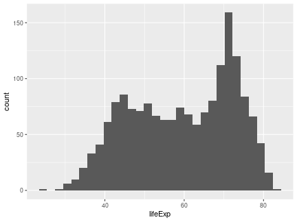<!-- --> ] --- # A Simpler Example: Histogram .pull-left[ ```r ggplot(data = gapminder, aes(x = lifeExp)) + * geom_histogram(binwidth = 1) ``` ] .pull-right[ 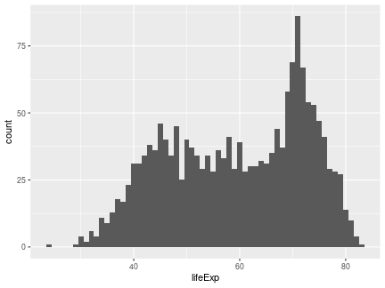<!-- --> ] --- # A Simpler Example: Histogram .pull-left[ ```r ggplot(data = gapminder, aes(x = lifeExp)) + geom_histogram(binwidth = 1, * color = "black", * fill = "lightblue") ``` ] .pull-right[ 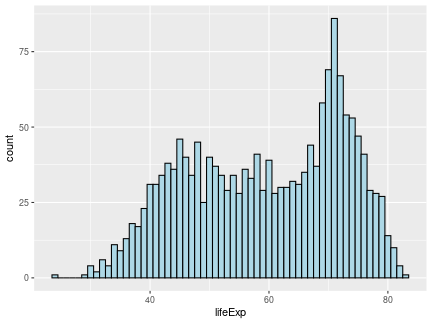<!-- --> ] --- # A Simpler Example: Histogram .pull-left[ ```r ggplot(data = gapminder, aes(x = lifeExp)) + geom_histogram(binwidth = 1, color = "black", fill = "lightblue") + * theme_bw(base_size = 20) ``` ] .pull-right[ <!-- --> ] --- # A Simpler Example: Histogram .pull-left[ ```r ggplot(data = gapminder, aes(x = lifeExp)) + geom_histogram(binwidth = 1, color = "black", fill = "lightblue") + theme_bw(base_size = 20) + * labs(x = "Life Expectancy", * y = "Count") ``` ] .pull-right[ <!-- --> ] --- # A Simpler Example: Boxplots .pull-left[ ```r *ggplot(data = gapminder, * aes(x = continent, y = lifeExp)) ``` ] .pull-right[ <!-- --> ] --- # A Simpler Example: Boxplots .pull-left[ ```r ggplot(data = gapminder, aes(x = continent, y = lifeExp)) + * geom_boxplot() ``` ] .pull-right[ <!-- --> ] --- # A Simpler Example: Boxplots .pull-left[ ```r ggplot(data = gapminder, aes(x = continent, y = lifeExp)) + * geom_boxplot(fill = "lightblue") ``` ] .pull-right[ 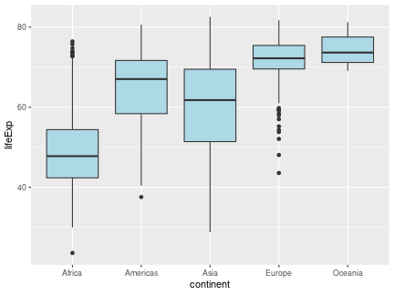<!-- --> ] --- # A Simpler Example: Boxplots .pull-left[ ```r ggplot(data = gapminder, aes(x = continent, y = lifeExp)) + geom_boxplot(fill = "lightblue") + * theme_bw(base_size = 20) ``` ] .pull-right[ 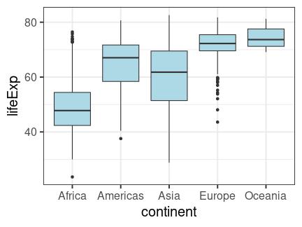<!-- --> ] --- # A Simpler Example: Boxplots .pull-left[ ```r ggplot(data = gapminder, aes(x = continent, y = lifeExp)) + geom_boxplot(fill = "lightblue") + theme_bw(base_size = 20) + * labs(title = "Life expectancy by Continent", * x = "", * y = "") ``` ] .pull-right[ 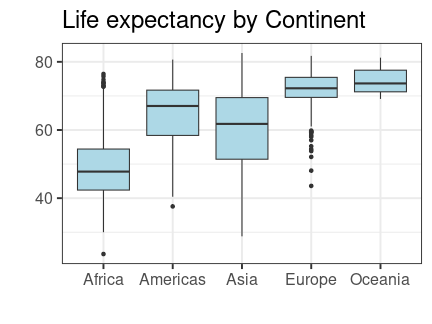<!-- --> ] --- # A Simpler Example: Boxplots .pull-left[ ```r ggplot(data = gapminder, aes(x = continent, y = lifeExp)) + geom_boxplot(fill = "lightblue") + theme_bw(base_size = 20) + labs(title = "Life expectancy by Continent", x = "", y = "") + * theme(plot.title = * element_text(hjust = 0.5)) ``` ] .pull-right[ 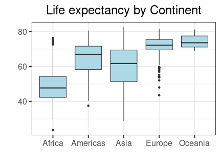<!-- --> ] --- # A Simpler Example: Boxplots .pull-left[ ```r ggplot(data = gapminder, aes(x = continent, y = lifeExp)) + geom_boxplot(fill = "lightblue") + theme_bw(base_size = 20) + labs(title = "Life expectancy by Continent", x = "", y = "") + theme(plot.title = element_text(hjust = 0.5)) + * ylim(c(0, 85)) ``` ] .pull-right[ <!-- --> ] --- # `ggplot2` Summary * Axes: `xlim()`, `ylim()`. * Legends: within initial `aes()`, edit within `theme()` or `guides()`. * `geom_point()`, `geom_line()`, `geom_histogram()`, `geom_bar()`, `geom_boxplot()`, `geom_text()`, etc. * `facet_grid()`, `facet_wrap()` for faceting. * `labs()` for labels. * `theme_bw()` to make things look nicer. * Graphical parameters: `color` for color, `alpha` for opacity, `lwd`/`size` for thickness, `shape` for shape, `fill` for interior color, etc. .pushdown[.center[[Here is a `ggplot2` cheat sheet!](https://rstudio.github.io/cheatsheets/html/data-visualization.html?_gl=1*m028c0*_ga*MTMwMzM1ODYzNC4xNjkwMTU1NDY5*_ga_2C0WZ1JHG0*MTY5NjcyMDAxNi4xNS4wLjE2OTY3MjAwMTYuMC4wLjA.)]] --- # Some Guidelines For Data Visualization .pull-left[## Don'ts * Deceptive axes. * Excessive/bad coloring. * Bad variable/axis names. * Unreadable labels. * Overloaded with information. * Pie charts (usually). ] .pull-right[## Do's * Simple, clean graphics * Neat and human readable text. * Appropriate data range (bar charts should *always* start from 0!). * Consistent intervals. * Roughly ~6 colors or less. * Size figures appropriately. ] --- # Which Plot Should We Use? Consider the following questions when we choose our plot: * What if we have one variable? Two variables? * What if we have numeric data? * How can we deal with those categorical or nominal variables? Let's see some examples! --- # One Numeric Variable: Histogram ### `geom_histogram()` <img src="Lecture4_Data_Visualization_files/figure-html/unnamed-chunk-121-1.png" style="display: block; margin: auto;" /> --- # One Numeric Variable: Boxplot ### `geom_boxplot()` <img src="Lecture4_Data_Visualization_files/figure-html/unnamed-chunk-122-1.png" style="display: block; margin: auto;" /> Note: We can also use the more sophisticated [letter-valued plot](https://vita.had.co.nz/papers/letter-value-plot.pdf) implemented in the package `lvplot`. --- # One Categorical Variable: Bar Chart ### `geom_bar()` <img src="Lecture4_Data_Visualization_files/figure-html/unnamed-chunk-123-1.png" style="display: block; margin: auto;" /> --- # One Numeric and One Categorical Variable ### `geom_boxplot()` Here, we have multiple observations for each category. <img src="Lecture4_Data_Visualization_files/figure-html/unnamed-chunk-124-1.png" style="display: block; margin: auto;" /> --- # One Numeric and One Categorical Variable ### `geom_bar()` (with argument `stat = "identity"`) Here, we have only one observation per category. <img src="Lecture4_Data_Visualization_files/figure-html/unnamed-chunk-125-1.png" style="display: block; margin: auto;" /> --- # Two Numeric Variables: Scatterplot ### `geom_point()` <img src="Lecture4_Data_Visualization_files/figure-html/unnamed-chunk-126-1.png" style="display: block; margin: auto;" /> --- # Two Numeric Variables, One Time-based ### `geom_line()` Note: When making a line plot, we should use both `geom_point()` and `geom_line()`! <img src="Lecture4_Data_Visualization_files/figure-html/unnamed-chunk-127-1.png" style="display: block; margin: auto;" /> --- # Two Categorical Variables ### `geom_bar()` setting `x` and `fill` within `aes()` This is an example of bad visualization!! <img src="Lecture4_Data_Visualization_files/figure-html/unnamed-chunk-128-1.png" style="display: block; margin: auto;" /> --- # Two Categorical Variables ### `geom_bar()` setting `x` and `fill` within `aes()` This one looks better by specifying `position = position_dodge()` in `geom_bar()`. <img src="Lecture4_Data_Visualization_files/figure-html/unnamed-chunk-129-1.png" style="display: block; margin: auto;" /> Note: Never stack the bars unless it is necessary. --- # Three Variables * What if we have two numeric variables and one categorical? -- * Scatterplot or line plot colored by category. * Scatterplot or line plot faceted by category. Note: Recall our example in the step-by-step practice with `ggplot2`. - More details about the choices of plotting and other data visualization concepts can be found in [this notes](https://github.com/zhangyk8/zhangyk8.github.io/raw/master/_teaching/file_stat302/Chap3.pdf). Please spend some time reading this notes! --- # Summary - R packages provide us with numerous handy functions that have been written by other R developers. - The `tidyverse` is a collection of packages for common data science tasks. - Pipes `%>%` allow us to string together commands to get a flow of results. - The `dplyr` is a package for data wrangling with several key verbs (or functions). - The `tidyr` is a package for manipulating data frames in R. - Base R has a set of powerful plotting tools that help us quickly visualize our data. - The `ggplot2` is a package for creating more sophisticated plots. Submit Lab 4 on Gradescope by the end of Tuesday (February 13)!! Start earlier!!